

Shadow Effects – CSS
- Posted by Tejas Hoskatti
- Categories CSS 3, HTML5, web development course
- Date November 18, 2011
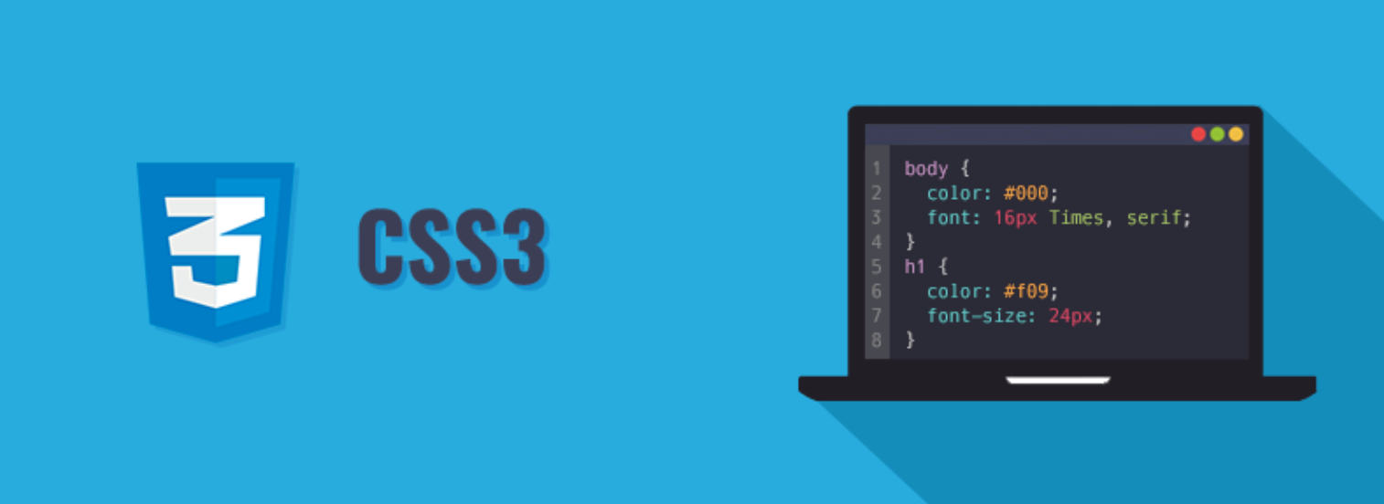
Cascading Style Sheets
CSS is the key presentational technology that is used in website design.
In this tutorial we will learn about the shadow effects, layering multiple shadows, text-shadow effects.
CSS property “box-shadow” allows us to add an shadow effect to selected HTML element, whereas “text-shadow” allows us to add effect to selected text.
We can also layer shadows one after another by using “box-shadow” property.
Following is the example which will show you how to add shadow effects using CSS:
For safari, chrome, etc:
Box-shadow: -webkit-box-shadow:15px 15px 20px 5px #000;
Text-shadow: text-shadow: 2px 2px 10px #FEFF49;
For mozilla :
Box-shadow: -moz-box-shadow:15px 15px 20px 5px #000;
Text-shadow: text-shadow: 2px 2px 10px #FEFF49;
For Opera, IE 9, IE 10, firefox 4.0:
Box-shadow: box-shadow:15px 15px 20px 5px #000;
Text-shadow: text-shadow: 2px 2px 10px #FEFF49;<!–NOT For IE 9, IE 10–>
Note that only IE 9 & IE 10 supports box-shadow property whereas previous versions do not.
Even firefox 4.0 supports box-shadow property, for previous versions to it you need to prefix moz before it.
Text-shadow property is not at all supported by any versions of IE browsers.
We can insert 3 values maximum upto 4 values to both box-shadow as well as text-shadow property:
- 1st value is for the horizontal length of the shadow. Eg: box-shadow:15px 15px 20px 5px #000; Eg:text-shadow: 2px 2px 10px #FEFF49;
- 2nd value is for the vertical length of the shadow. Eg: box-shadow:15px 15px 20px 5px #000; Eg:text-shadow: 2px 2px 10px #FEFF49;
- 3rd value is for the blur radius – the degree of the blur shadow. Eg: box-shadow:15px 15px 20px 5px #000; Eg:text-shadow: 2px 2px 10px #FEFF49;
- 4th value is for a spread distance. Positive values cause the shadow shape to expand in all directions by the specified radius. Negative values cause the shadow shape to contract. Note that for inner shadows, expanding the shadow (creating more shadow area) means contracting the shadow’s perimeter shape. Eg: box-shadow:15px 15px 20px 5px#000; Text shadow doesn’t have any value for spread distance.
- 5th is the color of shadow. Eg: box-shadow:15px 15px 20px 5px#000; Eg:text-shadow: 2px 2px 10px #FEFF49;
- The keyword ‘inset’ is used to change the drop shadow from an outer shadow to an inner shadow. Inset keyword is not used in text-shadow property Eg: box-shadow:inset 15px 15px 20px 5px #000;

Startup Expert, Business strategist, Digital Marketing & Brand strategist, 10x Engineer
Expertise– Robotics, Web & Mobile App development, Digital Marketing and Brand Advertising
14+ years of experience in design and development of IT products & services (hospitality, restaurant, retail, education, etc)
10+ years of experience in demonstrating influencer marketing and strategy, planning and online promotions with the best Digital Marketing practises.
Profound knowledge and experience in Structured data, Cloud & Server handling
You may also like

HTML 5 APIs explained
12 November, 2013

PHP – AJAX
19 February, 2013

What Is Cloud Computing?
6 April, 2012